Looking for guidance on examining and interpreting Mobility Metrics data for your community? This guide, and accompanying worksheet, offer five steps for getting started.
This guide walks through the steps using an example analysis from Washington, DC, and screenshots from the Upward Mobility Data Dashboard. It also includes additional resources for improving your data and understanding how to use them. Follow the steps sequentially, as each step builds on the information you gather in the one before it.
When you’re ready to follow the steps yourself, download the blank worksheet.
Step 1: Select a predictor and look at the topline, summary-level statistic for its corresponding metric.
Note: Some predictors have two metrics.
Ask yourself:
- What stands out about this metric’s value?
- How does this reflect (or not reflect) my knowledge and perceptions of upward mobility in my area?
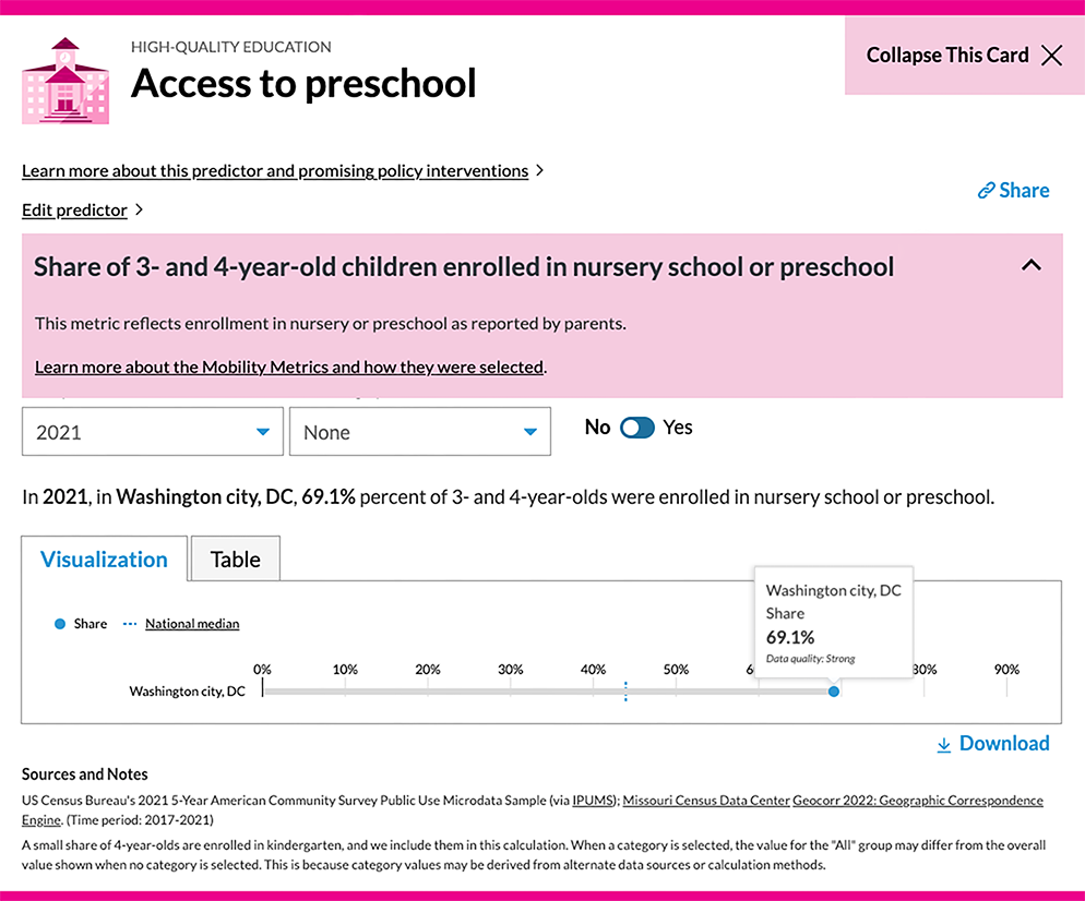
For this example analysis, we look at the access to preschool metric for Washington, DC. (Though we use Washington, DC, as our example in this guide, the example analysis is hypothetical.) As the screenshot below from the data dashboard shows, the topline value is 69.1 percent. That is the share of all 3-to-4-year-olds in DC who were enrolled in nursery school or preschool in 2021.
- What stands out about this metric’s value?
Preschool enrollment has implications for future educational success and, ultimately, upward mobility. DC’s enrollment rate seems much higher than that of the national median, which is promising. However, with more than 3 in 10 children not enrolled in preschool, there’s room for improvement. - How does this reflect (or not reflect) your knowledge and perceptions of mobility in your area?
DC is a fairly segregated city, so there may be certain neighborhoods where there is a concentration of children not enrolled in preschool. Such children may live in zip codes that are lower income, have larger child populations, or have low transportation access. Parents in the community have reported that limited spots in government-subsidized preschool programs prevent them from enrolling their children. As a result, they care for their children themselves or rely on a family member to watch them
Step 2: Select a category to break down the metric’s topline value into values for different subgroups.
Note: We use “category” to describe the different subgroups into which Mobility Metrics data can be broken down or disaggregated. Available categories differ across metrics, ranging from racial and ethnic groups to income levels. Not all Mobility Metrics data can be disaggregated, so some metrics don’t have categories.
Ask yourself:
- How do these values differ from the topline value for the whole population? Do the values differ across categories?
- If there are disparities in the values for different categories, which disparities stand out the most and why?
- How do these values differ from the topline value for the whole population? Do the values differ across categories?
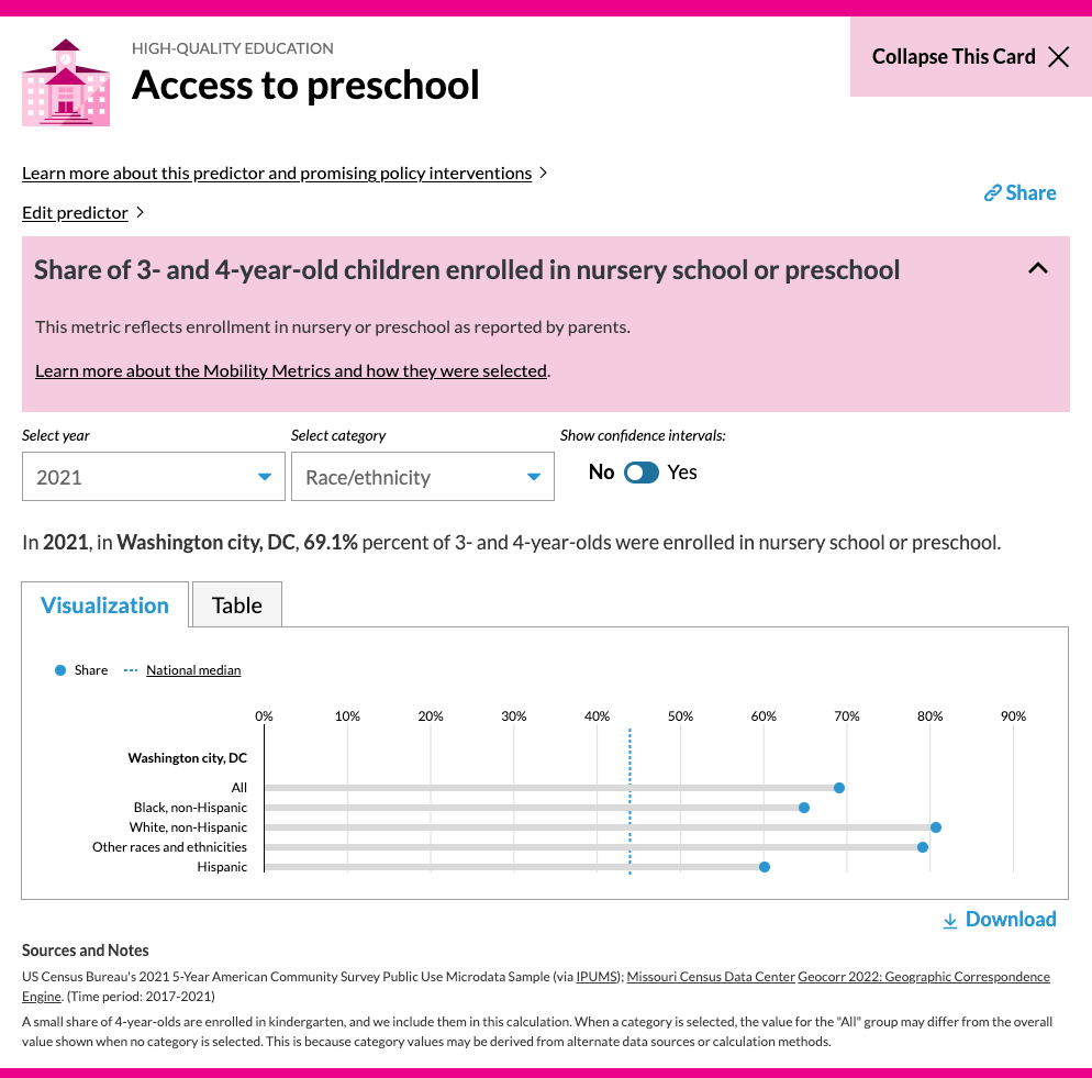
In DC, access to preschool varies significantly by race and ethnicity. In 2021, only 60.1 percent of Hispanic children ages 3 to 4 and 64.9 percent of Black children were enrolled in preschool, compared with 80.8 percent and 79.2 percent of white children and children of other races and ethnicities, respectively. - Which disparities stand out the most and why?
Enrollment for Hispanic 3-to-4-year-olds is particularly low. What factors might explain the gap in enrollment between Hispanic children and those who are white or other races and ethnicities?
Step 3: Look at these data over multiple years.
Ask yourself:
- Have the data changed or mostly stayed the same? What trends emerge across categories in the data and why?
- Is it surprising how the data have changed or stayed the same? Do the trends I’m seeing align with my knowledge about conditions in the community over those periods?
- Have the data changed or mostly stayed the same? What trends emerge across categories in the data and why?
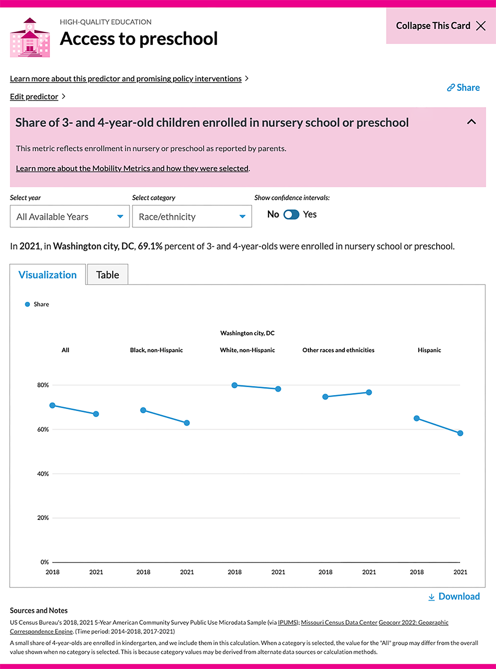
For nearly all available racial and ethnic categories (except the “other races and ethnicities” category), the share of 3-to-4-year-olds in preschool or nursery school decreased between 2018 and 2021. The decrease was most pronounced for Hispanic children, whose enrollment fell from 67 percent to about 60 percent. - Is it surprising how the data have changed or stayed the same? Do the trends you’re seeing align with your knowledge about conditions in the community over those periods?
The COVID-19 pandemic may have affected these numbers, but further exploration is needed to determine why Hispanic children’s enrollment was disproportionately affected between 2018 and 2021. lt may be valuable to examine different demographic groups’ access to transportation and preschool enrollment in the city to better understand trends in the data.
Step 4: Select one or more peer communities and look at their metric values alongside your own.
Ask yourself:
- How does my community’s metric value compare with the values for the peer communities?
- What’s most notable about these differences?
- What environmental factors in my community, the peer community, or both communities might account for these differences?
- How does your community’s metric value compare with the values for your peer communities?
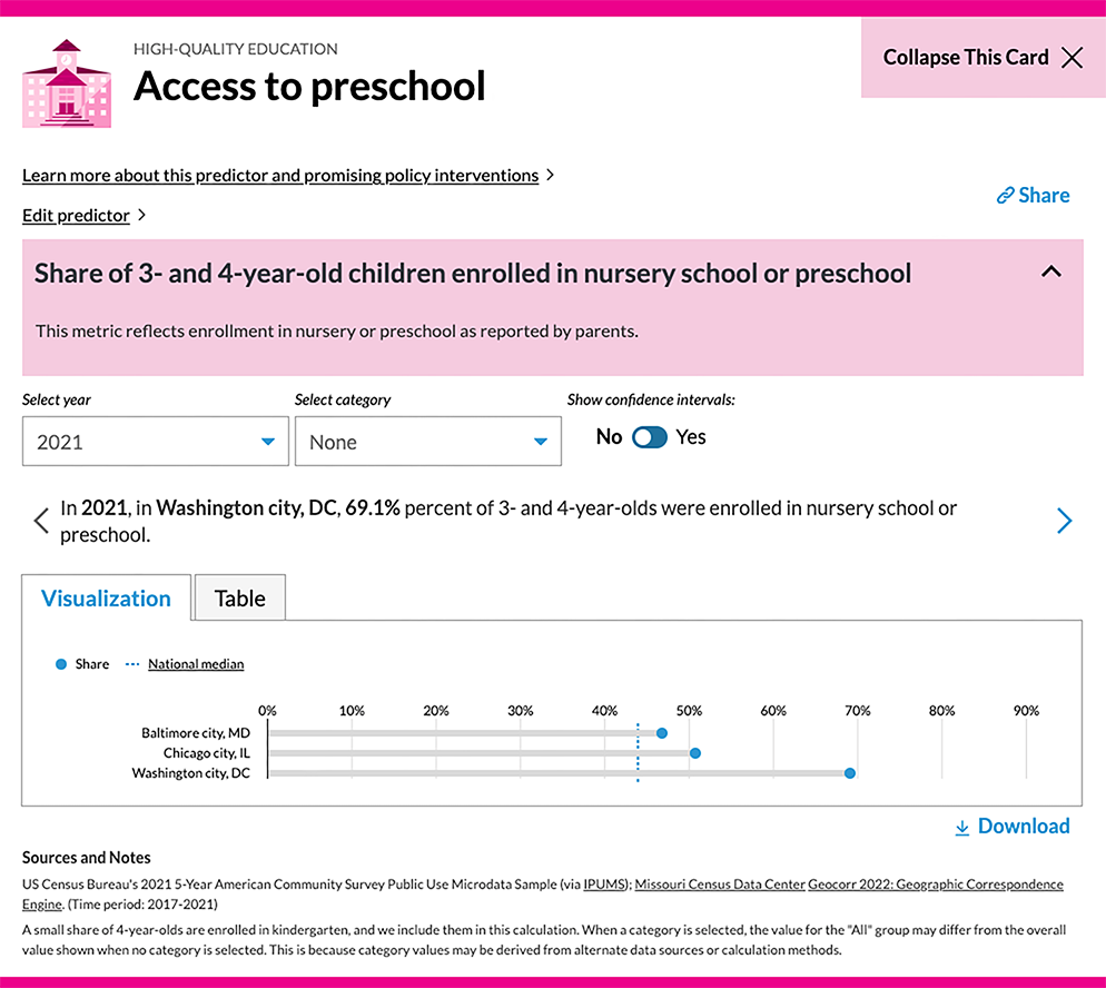
Comparing DC with Baltimore, its neighboring city, and Chicago, a city that has similarly prioritized increasing preschool enrollment, highlights that DC has stronger outcomes for this metric, despite all three cities offering free preschool programs for children in this age group. - What’s most notable about these differences?
On average, the share of 3-to-4-year-olds in DC who are enrolled in preschool or nursery school is about 20 percentage points higher than the shares of such children in Baltimore and Chicago. - What environmental factors in your community, the peer community, or both communities might account for these differences?
Both comparison cities have lower median incomes than DC, which may account for some of the difference. DC may also have more enrollment spots and therefore increased access to free, high-quality preschool programs. Expanding this comparison to include other neighboring communities, such as Prince George’s County and Montgomery County in Maryland and Arlington County in Virginia, may uncover further insights into factors affecting access to preschool in DC.
Step 5: Select additional metrics within and across pillars to identify systemic trends.
Ask yourself:
- Looking across all the pillars and specifically at the pillar for the metric I just analyzed, what other predictors may affect or be affected by this metric?
- How might I be able to use the data visualization for the metric I selected?
- Looking across all the pillars and specifically at the pillar for the metric you just analyzed, what other predictors may affect or be affected by this metric?
Access to preschool can be affected by many other predictors of upward mobility. For example, effective public education could affect preschool access because community trust in the quality and safety of preschool institutions could affect enrollment interest. Housing affordability, housing instability, and transportation access could also affect the accessibility of preschool, based on commute times and geographic enrollment requirements. Employment opportunities, jobs paying living wages, and opportunities for income can all affect and be affected by access to preschool as well. Adequate child care and education allows parents to work more traditional hours, improving both employment and income prospects. At the same time, higher incomes can support more flexible transportation options and access to housing with shorter commute times to both work and school. - How might you be able to use the data visualization for the metric you selected?
This data visualization clearly illustrates racial disparities in preschool access in DC. Local leaders could download it and use it to make the case for increasing the number of public preschool programs and classrooms and ensuring they’re equitably located across the district, especially in underserved areas.
When paired with other local data sources and insights, communities can use this information to guide decisionmaking, inform advocacy efforts, engage with and educate residents, and improve programs.
Explore more Mobility Metrics resources
Now that you’ve examined your metrics, view these resources to improve your data and learn how to use them:
